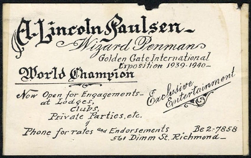
An artist, Parkinson grew up in the San Francisco Bay Area, and was fascinated by typography and penmanship, inspired by a man who lived across the alley from his family. “His name was Abraham Lincoln Paulsen. Some days I would spend hours watching him work in his studio. Lettering showcards for stores, designing and lettering awards and proclamations, and lettering names on high school and college degrees. He had a lettering act where he would entertain at parties with demonstrations of upside-down and backwards number lettering and other lettering tricks. Mr. Paulsen called himself The Wizard Penman and Paulsen the Pencilmaniac. He had a booth at the Golden Gate International Exposition on Treasure Island where he would amaze spectators with his lettering gymnastics. Sometimes, in his studio, he would take a break from work and amaze me with those same tricks. I was thoroughly charmed. My life-long love of lettering had begun before I even knew how to read.”
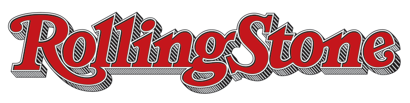
To further his interest, Parkinson studied advertising design and painting at the California College of Arts and Crafts in Oakland, graduating in 1963. He was quickly hired by Hallmark Cards, working as a lettering artist. But a connection got him some freelance work: in 1971 he was brought in to work on issues of Rolling Stone magazine, which was then based in San Francisco, creating lettering and drawings. In 1977 the publisher asked him to make a new letterform logo for the cover; it was used until 2018, and then he worked on a “flatter” version that was used for four more years. The current logo retains much of his design, including what the magazine calls “the now-iconic elongated tail on the ‘R’.”
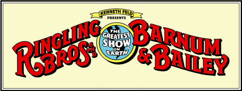
That work led to other newspaper and magazine logo commissions, for Fast Company, Esquire, Billboard, Newsweek, the San Francisco Examiner, Men’s Journal, California magazine, Variety, Los Angeles magazine, the Montreal Gazette, the Virginian-Pilot, and dozens of others in several countries. Non-publishing logos included the Doobie Brothers, Creedence Clearwater Revival, and the Ringling Bros. and Barnum & Bailey Circus.

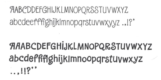
One thing all of these commissions had in common: complex lettering designs, which he typically drew by hand as Paulsen had done. It’s no surprise that Parkinson is also well known as a font designer, either coming up with new fonts on his own, or reworking older classic fonts, such as Bodoni for the International Typeface Corp. In all, he designed (or redesigned) 44 different font faces, which often involved multiple variants. (For instance, his original Electra font included Regular, Italic, Bold, Bold Italic, Heavy, and Heavy Italic.) Electra was used extensively by the San Francisco Chronicle. A logo sometimes led to a font: the pen-and-ink lettering he did for the circus “eventually evolved into the Modesto font family,” he said. Parkinson died June 27 from Alzheimer’s disease. He was 83.